Latest sundae: Your Everyday Happycore
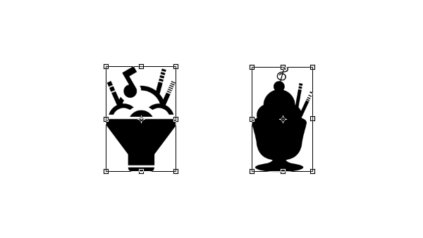
The old logo...
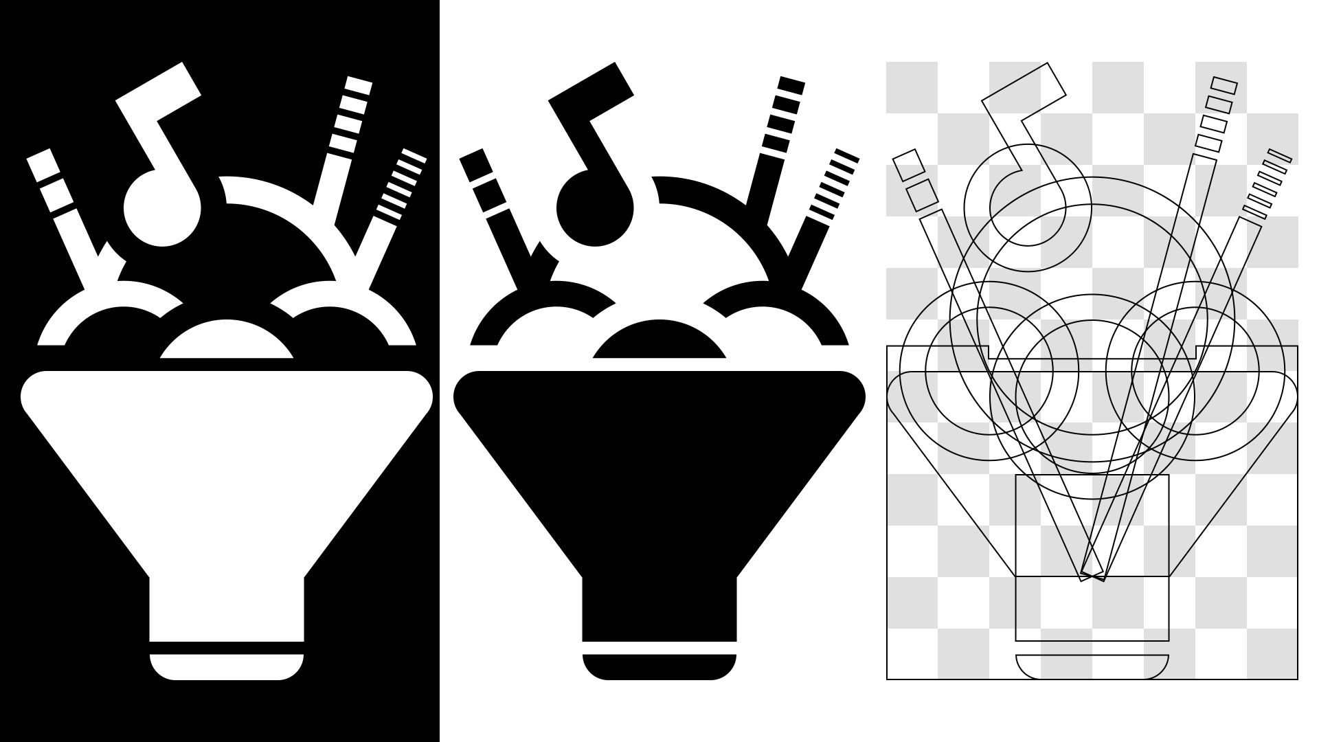
ㅤㅤ...was lame design-wise (for example, you can barely tell it is a cup of sundae when it is smaller), so we are making a new one. Plus, we think it is the time for some renovations. Is this good enough for you?

ㅤㅤIt is a lot more convenient to use in the arts since its bounding box is in an exact 2:3 ratio and the center pivot is at the center of the cup now.

ㅤㅤWe make a new text logo as well, but it looks 99.5% like the old one. Then why bother remaking it? Because we are planning to change the default font we use on visualizer and arts to Tex Gyre Adventor from Century Gothic. The new text icon is based on that font. The two fonts look pretty much the same, but the former has a larger set of characters.
ㅤㅤWe also added a neat hidden gimmick inside this icon (hope it is easy enough to find, though). Just putting in some symbols, as we did with the old icon, does not do justice for us.
Noisysundae Visualizer 3.0 + the new default art theme
ㅤㅤHere are the key features of the new default visualizer.
ㅤㅤ• Randomly plays one of three visualizer styles. (This means making 3 different visualizers packed in one!)
ㅤㅤ• Extend the silent start (sundae info part) to 10 seconds
ㅤㅤ• Add some messages like tips or seizure warning (apart from audio volume warning) in the silent start
ㅤㅤ• Key signature/BPM change popup during the play
ㅤㅤIf you have an idea to add, feel free to tell us in a comment. For the theme, we intend to make some sample pictures of what we have in mind (something like this) and post them here later.
Halcyon9039
Hmm ok lol
Noisysundae
I'm glad to know you read this post at least. If there's anything to say, I'm all ears. :)